Maserati Font – Italian Love Letters
While every car brand tries its best to be distinctive in their styling and fit out, they also pay attention to the lettering that they attach to the bodyshell. These attachments, that signify the model and engine specifications, have become a language of its own. A name, a number and some random letters can be found on the rear of every car as well as, sometimes, adorning the side of the car just behind the front wheel arch.
But some carmakers take this more seriously than others such as their automaker with their Maserati font. While some manufacturers perform this duty in a perfunctory way, as if pulling random metal shapes out of a bucket of letters and numbers, others expound the essence of the car into this feature as well.
Look on the back of most vehicles and you will see very generic lettering stuck on to it. Models of Ford, Toyota and other mainstream brands, all take this adornment as a chore. Individually stuck on from a basic selection in their factory.
Even the luxury German brands of Mercedes-Benz and BMW take a basic and minimalist style to the lettering. Both Teutonic autobahn cruisers keep it to just three numbers and a couple of letters placed in one corner of the rear of the car.
Some brands take this a stage further. Rolls-Royce, Bentley and Ferrari have a selection of different vehicles available but all of them are naked at the back. These brands steadfastly keep the rear of the car empty and clean of lettering. This highlights their exclusivity and thoroughbred lineage – their owner knows what car it is and that’s all that matters.
Looking back over the decades and some characterization does become apparent. Some of the iconic Ford automobiles of the 1960’s have the name written in a stylish flourish. Set like metallic handwriting, the name of the car is affixed to the rear and placed on a slant like a signature.
But if you look behind a Maserati, things look quite different.
Maserati Font
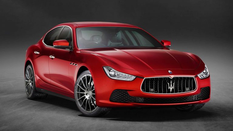
Maserati, the flamboyant Italian carmaker from Modena, take this part of the car just as seriously as everything that goes before it. From the brand name, to the model, to the delineation, all are well represented on the edge of the trunk. But, unlike any other automobile on the road, Maserati ensures these letters have just as much style, panache and cachet as the rest of the car.
What they have achieved with the Maserati font is very distinctive, in both the typeset and the layout. The Maserati font is something that is not seen anywhere else. Laid down like cursive script, it glides across the back of the car in a very fashionable way. With each letter attached to the next, the names flow as well as giving the resemblance to speed.
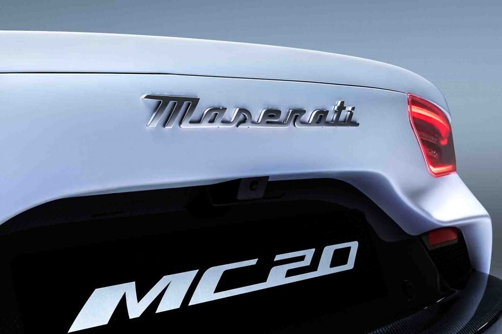
Like proper cursive script, the letters don’t appear in one setting but begin with upper case and continue in lower case. This gives the lettering such a more individualized and personal aspect. Giving the impression that this has been freshly inscribed over the body of the car.
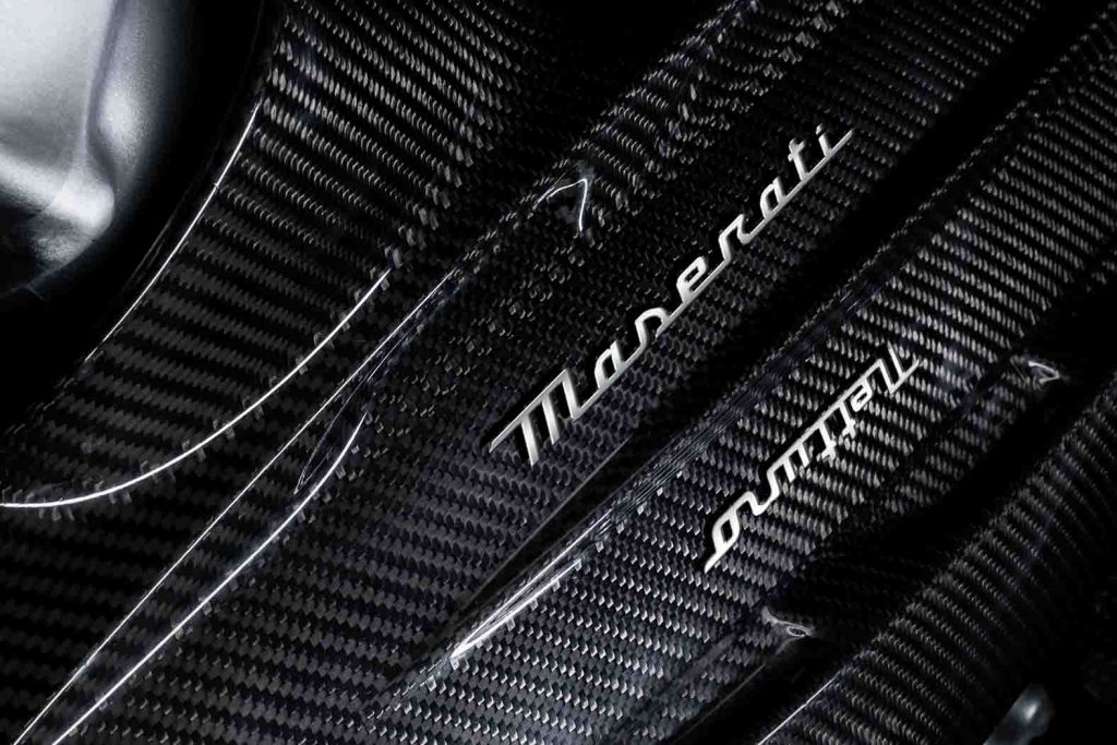
This is continued inside the cabin, as the model’s name is etched into the dash, in front of the passenger seat. Maserati are not shy in making sure their name is clearly marked on all surfaces. Even the door sills are engraved with names or iterations of the model.
The Maserati font is timeless, neither retro or futuristic but sitting out of time and creating a special sense of what Maserati stands for.
Maserati Font on the Side
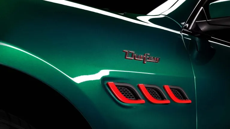
Maserati have continuously taken advantage of their front side panels to increase the personalized nature of their productions. Like an artist placing his signature on a canvas, the Maserati font is discreetly written as a side emblem behind the front wheel arch and sometimes located above their iconic triple air vents.
Here is the place where their identify the iteration of the vehicle. Whether it is a GT, GranLusso or GranSport, these important words are written in similar cursive script and sit low and unobtrusively on the side panel. To emphasize the importance of the Trofeo name, this is placed above the air vents as a small and tastefully applied tag.
Though for many years the Maserati font has been a high point, contributing to their unique style, this has not always been the case.
Maserati Font Gone Wrong
During the 1980’s and ’90s, such considerations were not so foremost in their minds. By comparison, take a look at the Quattroporte III, made in the 1980s. Block capital letters, two different sizes, spell out the company name and model. A perfunctory stamp set in the corner of the trunk and no different to a thousand other automobiles on the road.
This only highlights the nadir of what Maserati had become during those dark days. It shows a lack of detail, a lack of attention and a lack of identity.
It is no surprise that, once FIAT and Ferrari, took back the Modena carmaker, they ditched these “bargain basement” letters and went for something more fitting for a Maserati.
But this was not a new design for the Maserati font but, typical of the legacy they follow, it was a resurfacing of a classic detail.
A Maserati Font to be Proud of
This unique, cursive script initially appeared on their first mass produced road car – Maserati 3500GT. When viewing the back of this iconic Maserati grand tourer, the familiar flowing letters (and numbers) can be seen. As if written across a piece of paper, the interlinked, cursive nature of the lettering makes the cars identify immediately special.
This would be followed by the first Quattroporte, which split up the cursive script either side of the license plate. While the Ghibli and the Bora would follow similar styling traits and stick with the cursive Maserati font.
This is the level of detail and attention to their legacy, that Maserati adhere to. Every styling detail, inside and out, has been carefully considered to reflect something specific to Maserati’s history. Leaving love letters stenciled on all their cars.
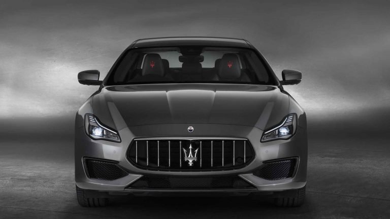
What Maserati font is used in the Maserati logo?
The Maserati Font utilized in the logo and emblem for the period of 2006 to present was a font that goes by the name of BrophyOpti Bold. This can also easily be substituted for another font called Bembo which looks identical.
Both of the fonts portray a classic and elegant feel which encapsulates Maserati’s rich heritage. Although, this Maserati Font was utilized by the brand most prominently from 2006 to 2020, it is still used in the Maserati emblem that sits on the front of all new cars today, but has since been replaced by the Maserati cursive style font that sits on the rear of their cars and combined with the Maserati Trident to complete their logo.
This signifies the brands identify of being a sleek Italian design that looks like it’s moving fast whilst standing still. This font is yet to be identified by anyone and it seems to be their own bespoke Maserati Font.
What Maserati font is used on the Maserati Website?
Identifying these fonts is a little less complex than trying to find the cursive style Maserati Font used in the new logo. Maserati sticks to a simple yet effective font for their online presence. They actually use a combination of the following fonts: Frutiger, Bebas Neue, Humanist sans, Grotesque sans.
The Maserati font choices create a clean and pure aesthetic for their online pages that perfectly represent the design philosophy for the brand. If they used anything too fancy it just wouldn’t portray that classic and timeless feel they are so well versed in producing.