The Maserati Logo – Tale of the Trident

No Logo, No Brand
It’s been 135 years since the first motor car rolled off a production line. The first was in 1886 from Carl Benz, one half of what was to become Mercedes Benz. Many motor companies have emerged during those years and only a few have become memorable by their distinctive logos; Mercedes Benz is one of them. Others that have achieved that status level are Rolls Royce, Aston Martin, BMW, Lotus, Porsche, Jaguar, Volkswagen and Cadillac. Even Ford’s simple logo is now iconic and instantly recognizable.
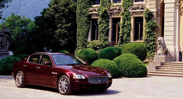
But, probably, the most distinctive, in its use and style must be that of Maserati and their decision to put a trident on the front of all of their cars. The Maserati logo has become a strong status symbol of their brand but what led them to this decision?
Maserati Meets Aquaman…sort of
So what was the driving force that led to Maserati putting the trident on their grille? Its story is part symbolic and definitely historic as to why they came to this design.
For instance, another distinctive logo, Ferrari, put their “Prancing Horse” on their cars for good luck. Originally used by an Italian World War I pilot, who painted it on his plane for good luck. This was suggested by his parents to Enzo Ferrari to paint on his racing car. The yellow background signifies the color of Enzo’s home town of Modena.
The Maserati logo shape signifies both Neptune and the city of Bologna; even the logo colors (of red, white & blue) have significance too. So, to understand this connection we must look to the humble beginnings of the company.
All Roads Lead to Bologna
The six surviving Maserati brothers would begin their fledgling automotive company in Bologna in 1914 though it would be another twelve years before their first car, Tipo 26, was manufactured and displayed the familiar trident on its grille. But it would not be until six years later, in 1920, that they would devise their distinctive Maserati symbol.
Mario Maserati was the more creative brother out of the family and made his name as a painter and an artist in Bologna. But he would put his artistic talents towards his brothers’ business enterprise to design a logo for them. The source of his inspiration came from a suggestion from one of the company’s financial backers and close family friend. This was marquis Diego de Sterlich, who told Mario to use the iconic symbol of Bologna – the Fountain of Neptune.
The statue of Neptune, located in Piazza del Nettuno (beside Piazza Maggiore), was erected in 1565. It commemorated the election of Pope Pius IV who came from Bologna. The design of the statue symbolizes power – Neptune’s power over the sea and the new Pope’s power over the land. This strong symbolic emblem had become synonymous to the city of Bologna for over 360 years. The epitome of Neptune’s image is his trident and its distinctive three prongs. So what better symbol to use for their motor cars?!
Neptune’s Power, Grace & Vitality
To signify Maserati’s intention of producing competitive high performance racing cars, they would augment it with the strength of Neptune himself. At the same time proudly stating the location of the company’s homebase. Even the color scheme of the Maserati logo holds significance too as red and blue are very symbolic of Bologna as well. Also, the blue trident signifies the source of Neptune’s strength, his domain over the seas. The red signifies the power and performance of the Maserati on the roads around the world. While the white background signifies the land where Maserati rules over all.
Although the Roman god, Neptune, and the Greek equivalent, Poseidon, are well known for their power over the sea, they were also worshipped as the gods of horses, Neptunus Equestor. So what better way to equate your motor car and to ensure the success of your “horsepower” then by empowering it with the God of Horses himself!
In recent years, they have connected the lettering of the car to the city of Bologna, as well. In 2003, they wanted to make the branding more consistent and reinvented everything. In doing so, they changed the font of the Maserati to ‘Bembo’ which was a text created in the 15th century by Francesco Griffo who came from Bologna.
Changing Face But Always Remains the Same
In 1937, the Maserati brothers would sell their company to another family, Orsi, who were based in Modena. But the Maserati symbol of Bologna remained and has done ever since. The two iconic Maserati symbols, that are placed on the front of the hood and the grille, have taken over a century to be perfected.
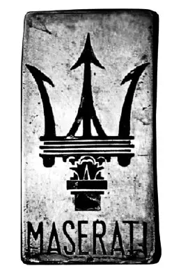
The first Maserati logo to adorn a car, in 1926, was quite basic in its design though the two fundamental aspects of it were already established. The three-prong trident and the name of the company underneath it, had been carved into a piece of metal that was a vertical rectangle. This was how it remained for the next eleven years.
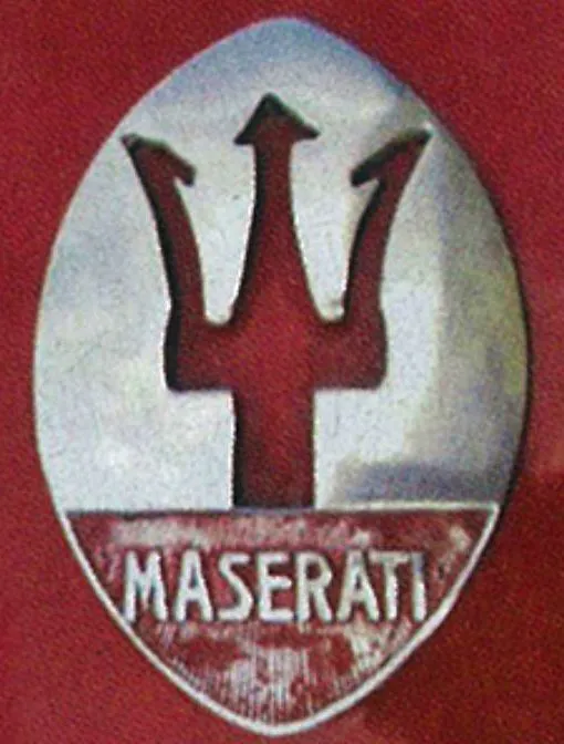
By 1937, the beginnings of the iconic badge were appearing. The rectangular emblem was now red in color and the trident appeared inside an oval with a white background. The name was written, somewhat, crudely beneath this.

In 1943, it took another radical change though still keeping with the basic oval pattern. The trident remained in red though everything else was now colored in blue. The Maserati name was now much larger and stretched along the bottom of the badge.
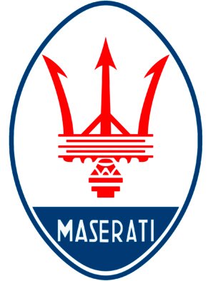
But it would be in 1951 that they hit upon a design that stood the test of time and has sat on the hood ever since. All aspects of the symbol – trident and name – sit within a vertical oval. The color scheme now had the traditional red, white and blue with a red trident on a white background with the name underneath in white lettering on a blue backing.
For the next 55 years, this badge has only seen marginal changes to it. The design of the trident has gone through changes as it adjusts from being simplified to becoming more elegant and modern while the font has had similar adjustments and become more stylish and iconic.

During the 1980’s, this badge was completely altered as they went for a more simplified emblem with a white oval that housed the trident in blue and basic black lettering for the brand name. Not surprisingly, this was ditched after just two years and they quickly reverted back to the badge you see today.
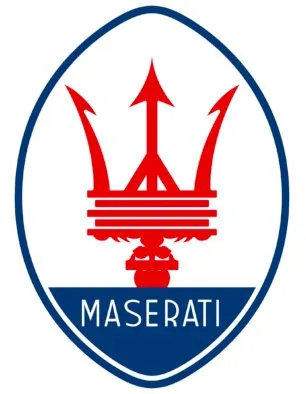
This is a perfect example of what the company were going through at the time. Maserati had multiple owners stretching from Italy, America and Argentina. This led to some bizarre business decisions as they completely abandoned producing their iconic mid-engined sports cars and began to produce four-door family sedans (albeit with a rather good V6 BiTurbo engine). Alfieri, the Chief Engineer, who had designed their most famous 3500 GT was fired on the day the Argentinian owner took over.
Into the Future
The year 2020 brings in a new chapter for Maserati as they discard the past and continue to look to the future. With the discontinuation of the Granturismo, they go back to the drawing board to design something that will supersede that model line. It was also announced that Maserati would create a new supercar, the MC20, their fastest and most responsive car yet.
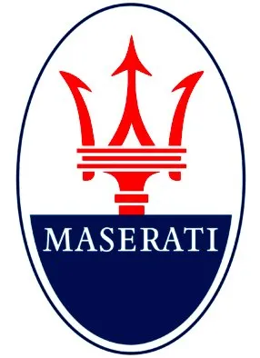
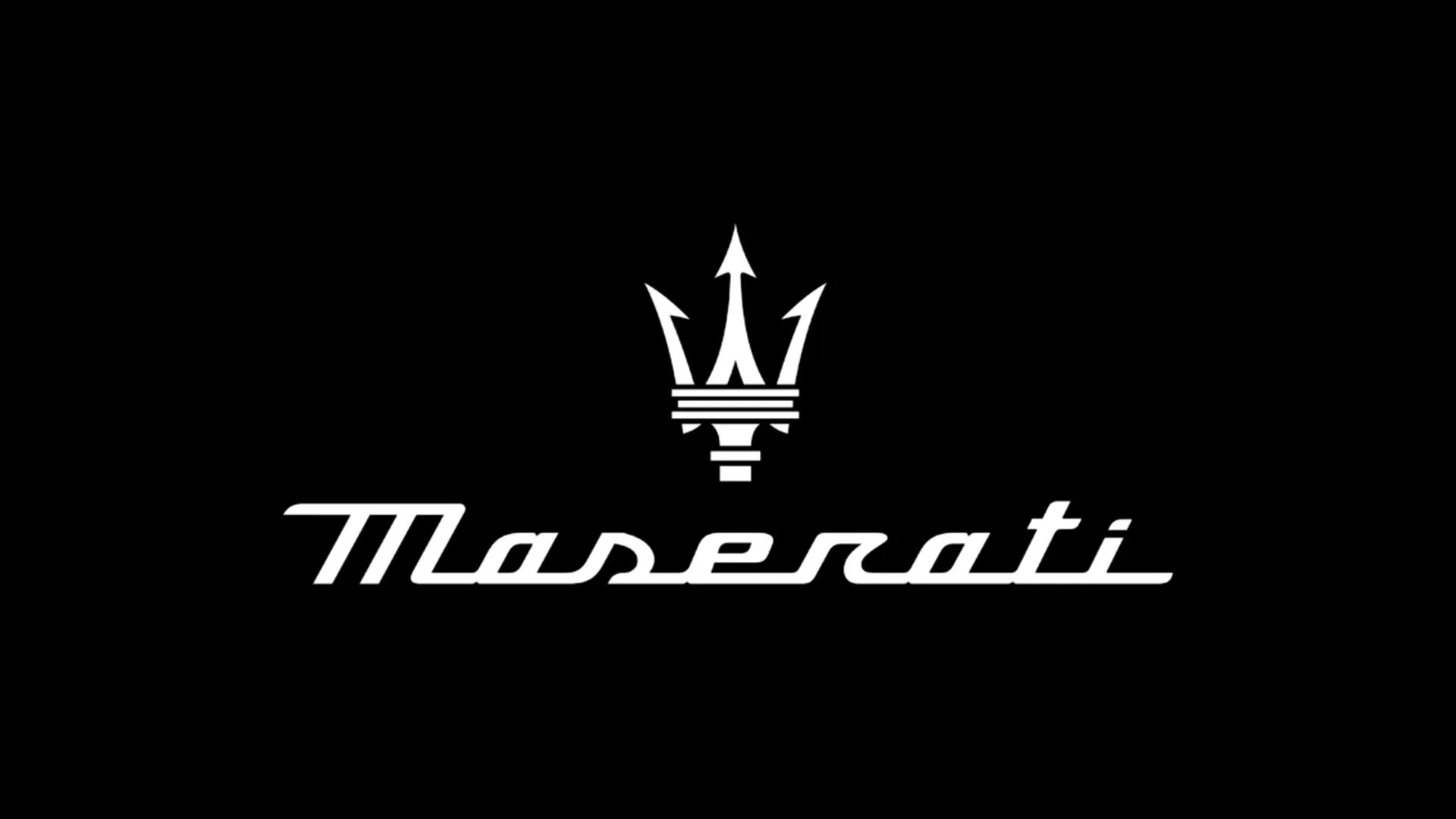
To match these new beginnings and in conjunction with their higher performance, some of the logos were changed again. The lettering which extends across the back of the cars was now given a makeover to reflect this. Using a custom cursive script, that saw all the letters linked at the bottom of the name, evoked the sense of fast acceleration and progress.

King Neptune
As the Maserati Motor Company moves into its second century of design and manufacture, it has come a long way from when a band of Italian brothers began making batteries and spark plugs. In all that time, the trident, that sits at the front of the car, has grown from being a familiar badge to being an icon that denotes a brand that stands for luxury, dignity, high performance and Italian aristocracy.
From their early days of zipping around racetracks of Europe to victory, to their later days of producing luxury two-door and four-door models that would glide around the streets all over the world. The Maserati symbol was fixed proudly at the front of every car leading the way in its motoring excellence.
If ever there was a logo that had achieved what it set out to do, it would be the Maserati logo. A symbol that would both readily identify the brand of a company and its product as well as epitomizing the overall quality and reliability of what they produce. Across the whole commercial spectrum, there are not many manufacturing companies that can say they have achieved the same standard of branded success for over a century.

